Adagio Sans Font Download
The Adagio Family is a part of Mateusz Machalski’s, Warsaw Academy of fine arts Master Degree Diploma in multimedia studio, conducted by Professor Stanisaw Wieczorek and his brave PHD Jakub Wrblewski.
Adagio is a modern type family. It consists of 3 main varieties: sans, serif and slab. Each one of them has it’s own true italic set. All of the styles together have over 400 characters in 9 different thicknesses.
The Adagio family was created mostly for company identities. The idea was to create a wide range of different varieties which are stylistically consistent. More…
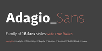
Adagio Sans - In its character, inspired by classical English typefaces.
Sharp chamfers add a strong character. Thanks to delicate contrast and proportions of capitals, this variety has features of humanist grotesque. Thanks to large x length, and highly stretched descenders, it also works correct in longer text, while its strong detail is good for headlines.
The Sans version is a great complement for Adagio Serif and Adagio Slab .
read more